|
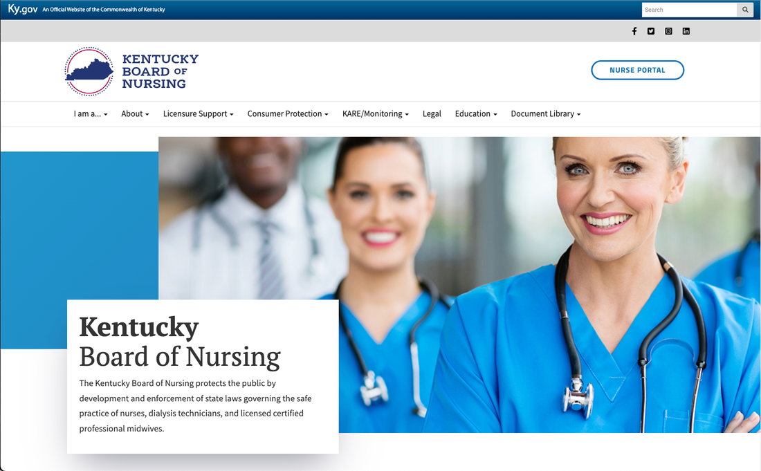
2023 The ChallengeThe Kentucky Board of Nursing redesign was implemented to restructure and overhaul the site architecture, as well as give it a fresh design. This site required ongoing client feedback to ensure content consolidation and an iterative process to remove outdated content. I was the design lead and architecture expert on this project. Getting StartedKBN had several primary goals: improving user experience, increasing accessibility, and enhancing content organization. Input was collected from various stakeholders, and other state board websites were researched and analyzed to identify best practices, design trends, and functionalities that could be incorporated into the new website. A thorough content audit was conducted to assess the existing content's relevance and quality. A determination was then made on what needed to be updated, revised, or removed, ensuring that all essential information was retained. Designing the SiteA new information architecture was developed for the website where the main categories and subcategories were defined, and organized into a logical and user-friendly structure. The color schemes, typography, imagery, and icons were carefully chosen to reflect KBN's mission to create an excellent user experience. The design showcases user-friendly navigation, clear call-to-action buttons, and intuitive user interfaces. The site was built using mobile first design principals, and was tested to meet current accessibility standards.
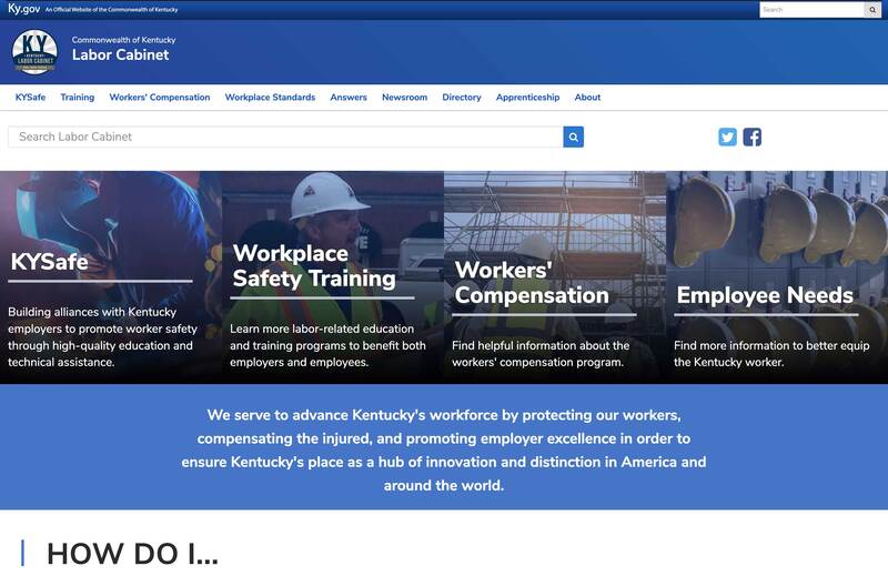
I also provided SharePoint training for the staff at the Kentucky Board of Nursing. This build was a combination of a custom SharePoint master page, page layouts, XSLT, and CSS. 2018 The ChallengeThe Labor Cabinet redesign was a complete rearchitect as well as design. The idea was to streamline a site that was traditionally agency-focused, and turn it into a user-focused experience. I was the design lead as well as the architecture expert on this project. It was solely my responsibility to deliver this project on time. Getting StartedThe first stage was understanding the personas that needed to engage with the content. After several fruitful meetings, I began streamlining the architecture into a site map that would make sense. The site began with well over 1000 pages, and ended with 60. The second stage was developing solutions that would mitigate common pain points of end users. Designing the SiteThis was accomplished with several targeted ideas.
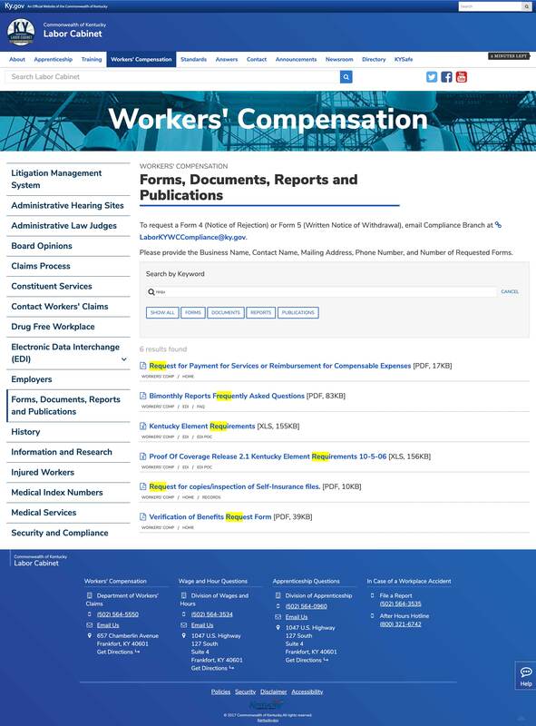
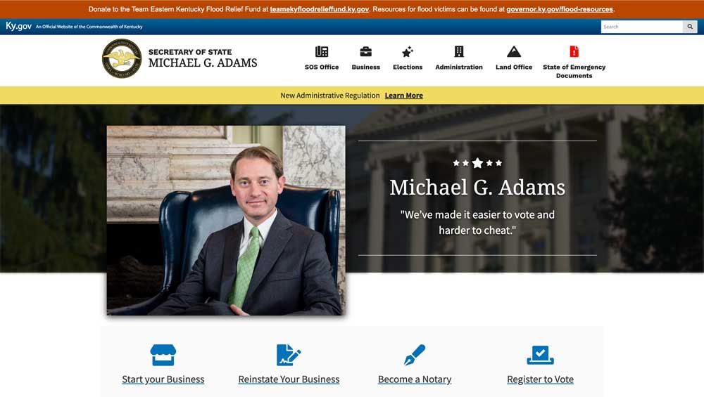
First, developing a document search that would function live on the page and be able to traverse through many types of documents was key. Utilizing keyword searches, as well as target categories, users were able to find the documents they needed quickly and easily in just a few clicks. This was reusable through many parts of their website. It was used for important forms, documents, reports and publications, as well as a staff directory. This was accomplished with a combination of JavaScript, custom XSLT templates, and SharePoint list data. Second, they would need a table of contents for their site pages to make navigation easy for their average user. It was important that it would be dynamic, and that it would update automatically as the page content changed. This was accomplished through JavaScript, and a custom page layout. Third, to ease the amount of change that both the staff and users would endure it was important to have something in place that would point them in the right direction. To meet this need I built the state’s first interactive ChatBot. It was built on Google’s DeepMind project. Since it was a learning AI, I taught them how to update the database manually to answer specific questions, but also how the AI could learn simply by talking to it. Additionally, I provided SharePoint training for the staff at the Labor Cabinet. This complete build was a combination of Sharepoint custom master pages, page layouts, CSS, JavaScript, and XSLT. 2020 The ChallengeThe Secretary of State redesign was implemented to replace the previous administration. This site had a quick turnaround, as well as an iterative process to remove traces of the prior Secretary where it was necessary. I was the design lead and architecture expert on this project. I worked alongside the client and my Creative Director for a swift turnaround. Getting StartedStage one was presence. Secretary Adams had to take ownership of this office. It was redesigned with a blue, black, and gold theme that drew inspiration from the official seal. He needed a decisive Jumbotron, as well as pages needed scrubbing for content that would no longer be relevant for his time in office. We worked with the client closely on page content updates. To help facilitate with these updates, we used a combination of ADA, and broken link scans to search for keywords that required updating. Designing the SiteIt was important the main navigation be clear and concise to end users. Using Google Analytics to inform us on user patterns, we worked with the client on specific wording, and icons were carefully chosen to convey their meaning. With this clearer navigation, it was necessary to shift pages within the architecture to reflect the new requirements.
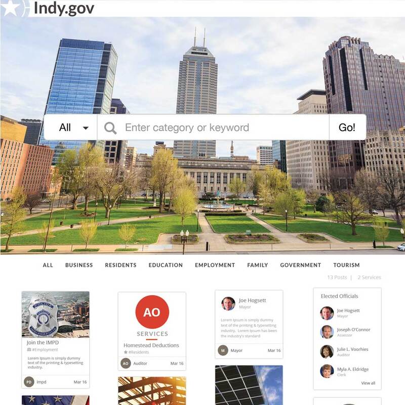
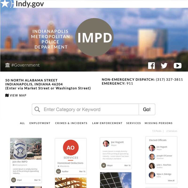
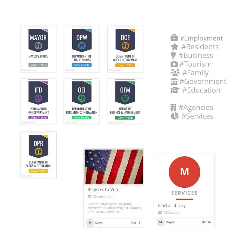
Additionally, it was important to highlight the main focuses of Secretary Adams and his office. A secondary navigation was added to highlight both business registration and voting. I also provided SharePoint training for the new staff in Secretary Adams' office. This build was a combination of a custom SharePoint master page, page layouts, and CSS. 2016 The ChallengeThe Indy.gov redesign was a complete overhaul and re-branding of the enterprise website. Preliminary work included a five month long project of streamlining their pages from the thousands down to a few hundred. I wrote the Indy.gov Font Styleguide to help agencies clean up their content ahead of any page migration. I also trained hundreds of city employees and interns in the SharePoint environment, as well as taught them web best practices, ADA, and section 508 compliance. This was done with the goal of site wide consistency. I was the SharePoint Team Lead and Senior designer, and we had a small team of 3 people. Getting Started.Using a combination of analytic tools, as well as feedback from the City of Indianapolis and its users, it was clear the site was not friendly to the people it was intended to reach. The main purpose of the site was to share information about the city, its agencies and services, and to drive people to use the online services to interface with the city government. Designing the SiteIn order to meet those needs, we developed nine flexible categories all of the city’s content could fit into. This metadata could then be used to tag all items within the site for ease of search. This search, then, would be the focal point of the entire site where users could use natural language in order to find what they’re looking for. This natural language would also be used as metadata to further tag content within the site to make it relevant. On agency pages within the site, the metadata reflected on the page would change based on content that existed for that agency. This would help users intelligently filter the content they are trying to find. We developed several sketches and wireframes to understand the choices that people would likely make based on the information presented to them. From that, we developed a streamlined workflow and UX design that would work for Indy.gov.
|
220 MediaCreative Content Studio ArchivesCategories
All
|
|||||||||||||||||||||||


 RSS Feed